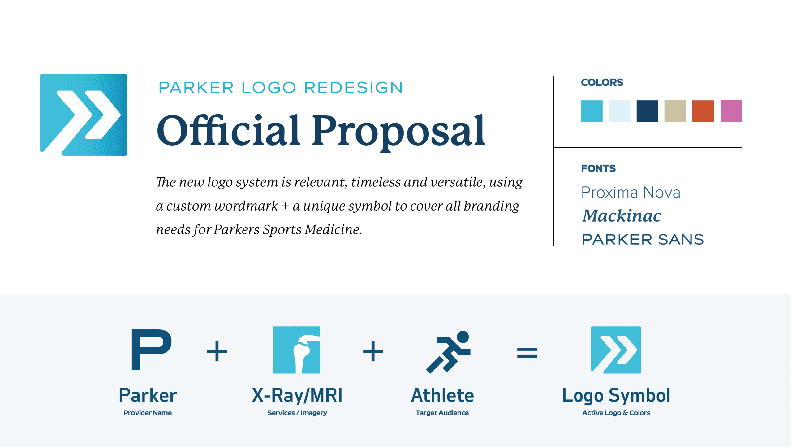


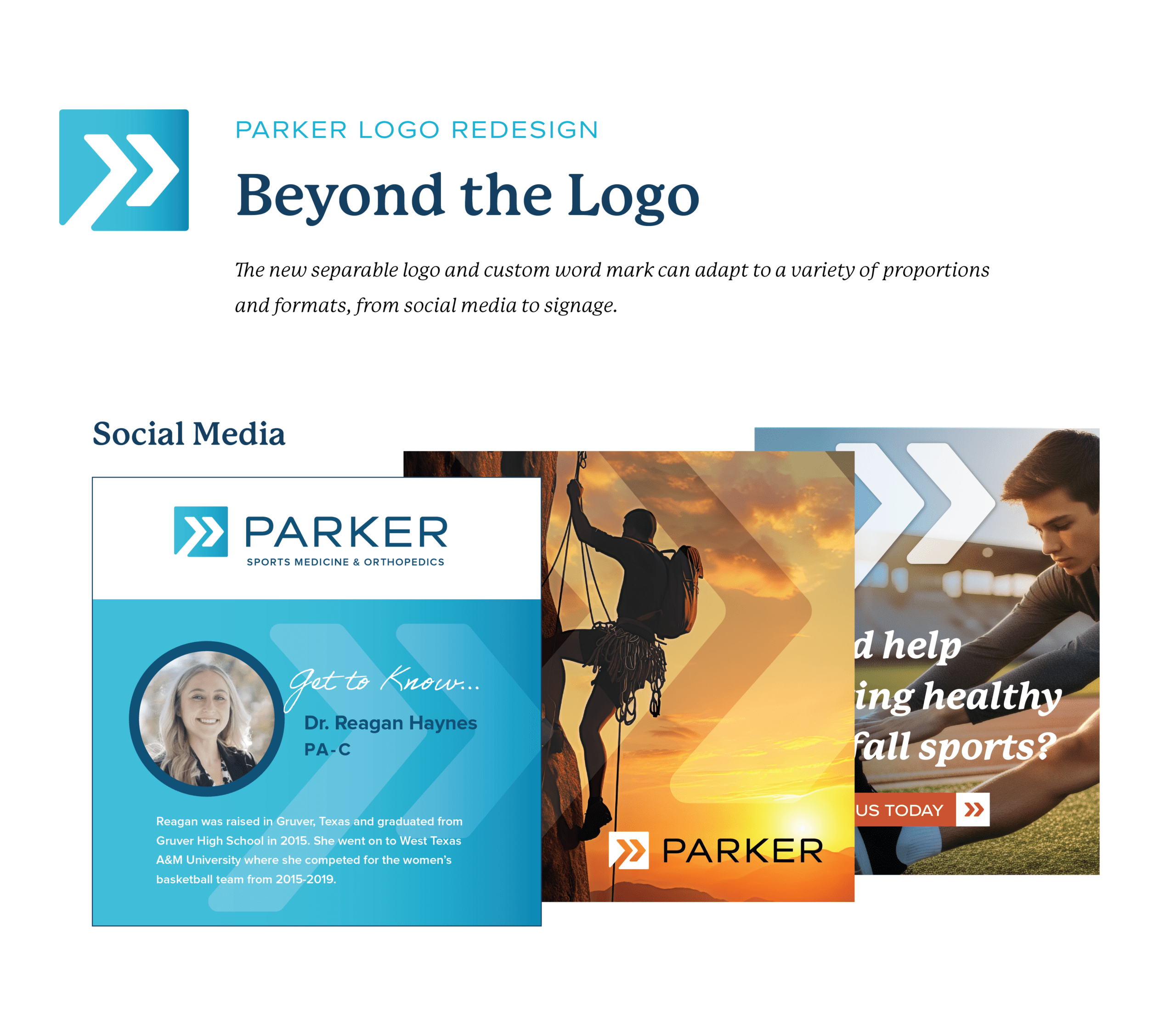
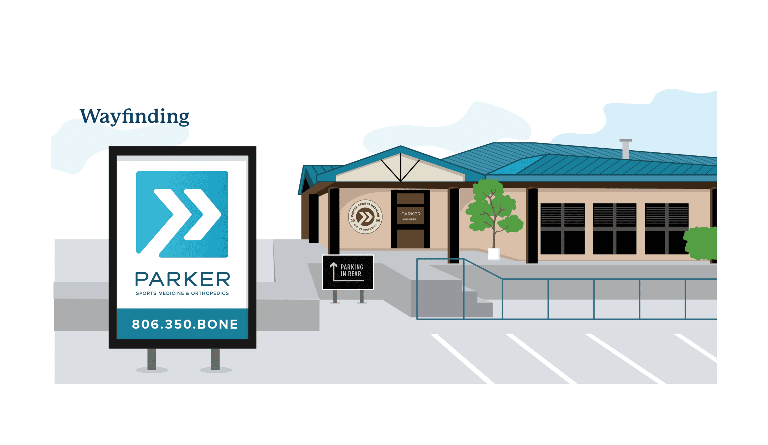
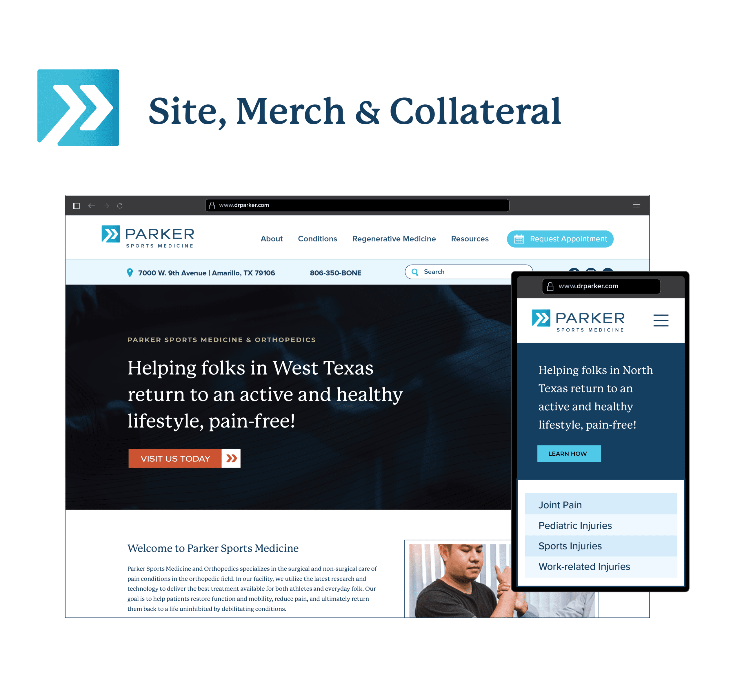
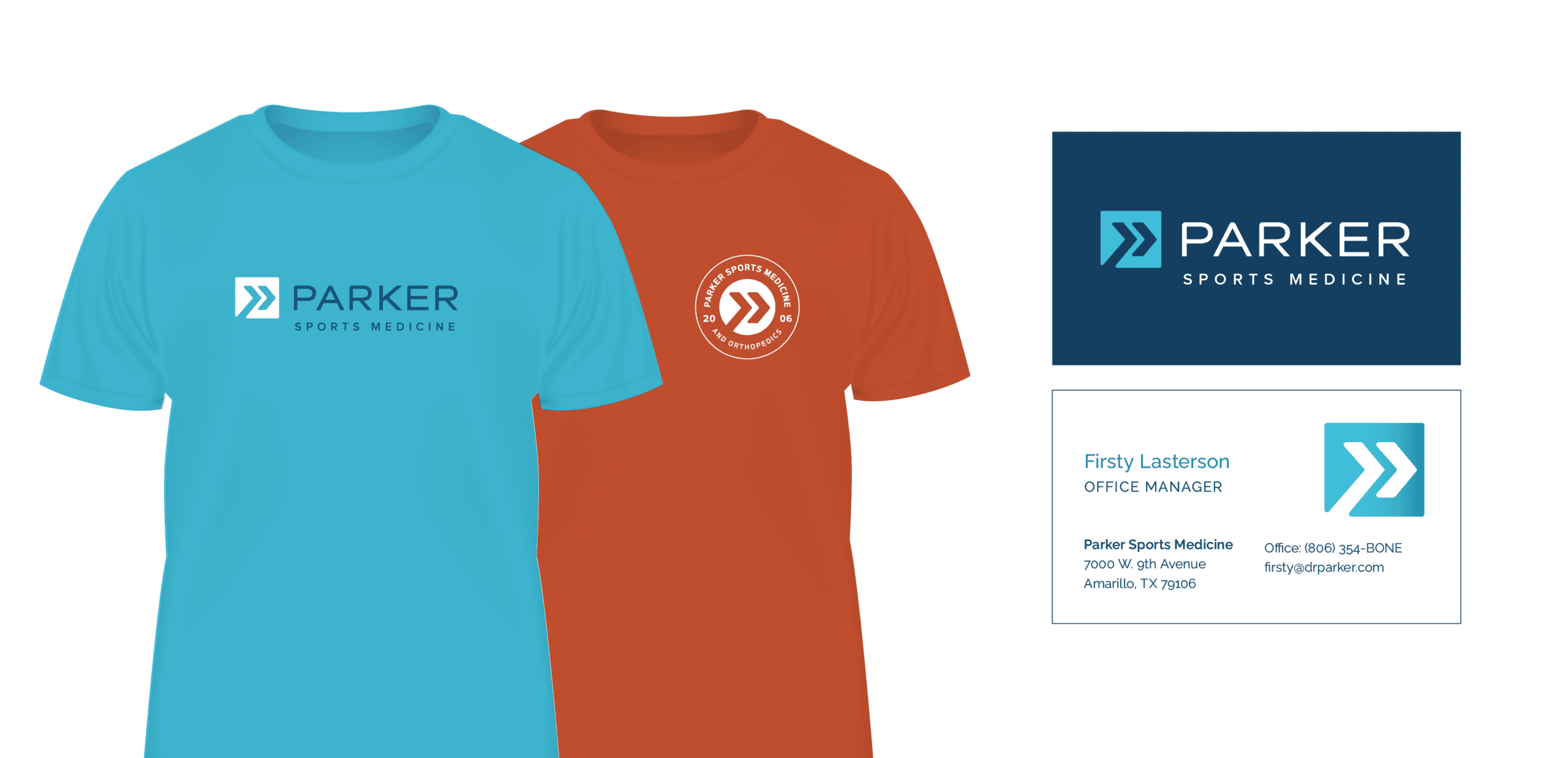

I built a website for Parker several years ago in a mad dash, without the time to address the branding. With the dust settled, and with several disparate versions of the logo floating around their collateral and online presence, I sat out to sync everything up into a fresh and cohesive brand.
The result is an abstraction of a runner plus a stylized P, to replace the clunky letter from the old version.
Let me know where you are in the process, whether you’re just flirting with the idea of changing, or you’re ready to hit the ground running tomorrow!