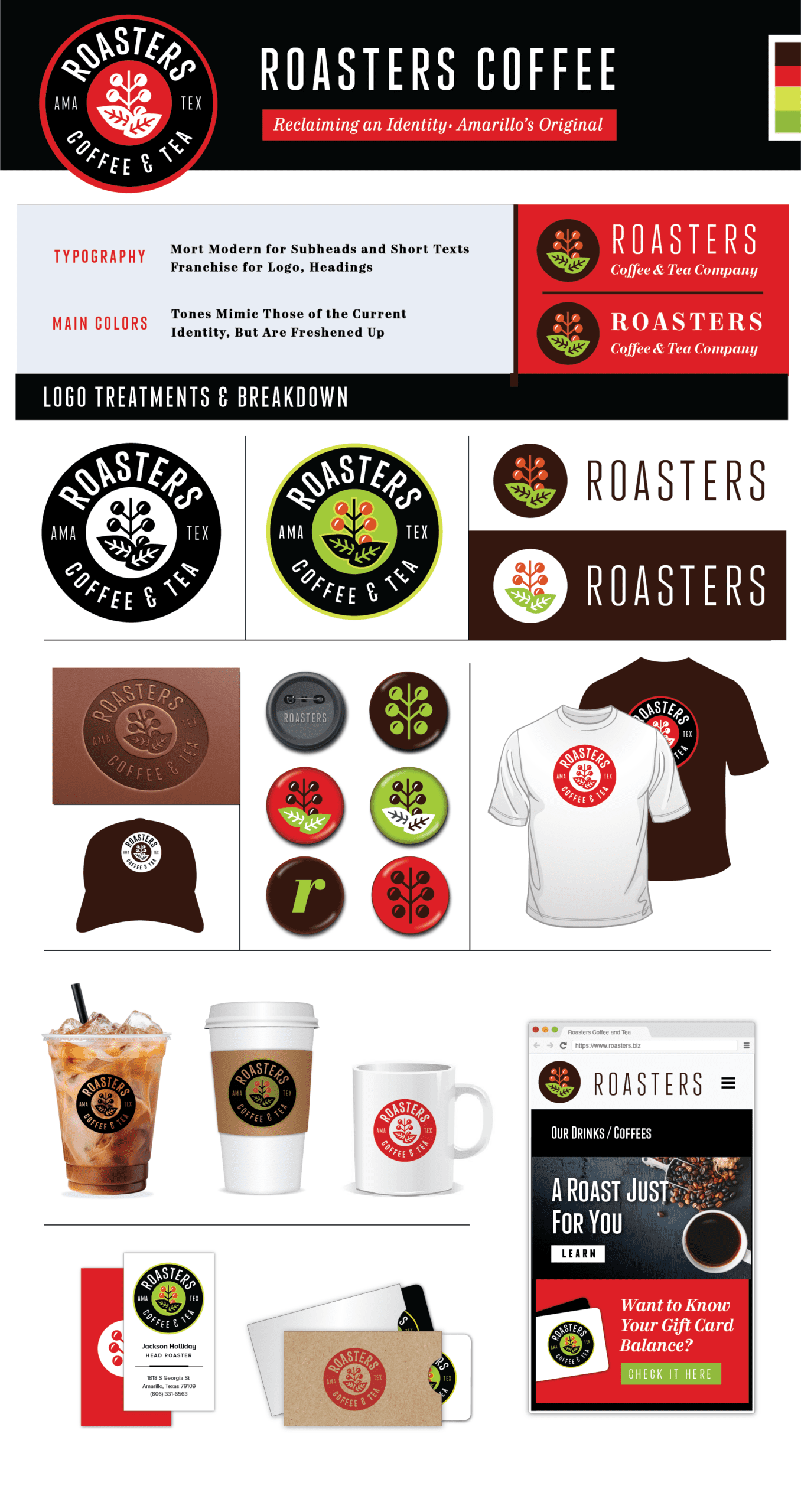
Roasters
The existing Roasters logo always struck me as awkward in that it relies on a silhouette of a cup as its logo. When the cup logo is then printed on a cup, it feels redundant. So I envisioned a cleaner, more focused logo that felt more earthy and less generic.
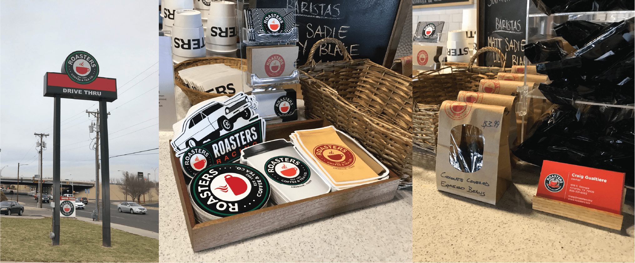
Before
After