


Coulter Drive Optical had been wanting to change their name for a while, so as they were building on to their offices we decided that would be a great time to move forward with a full rebrand. The biggest challenge was that all the obvious symbols and motifs for eyes, vision and medicine were overused.
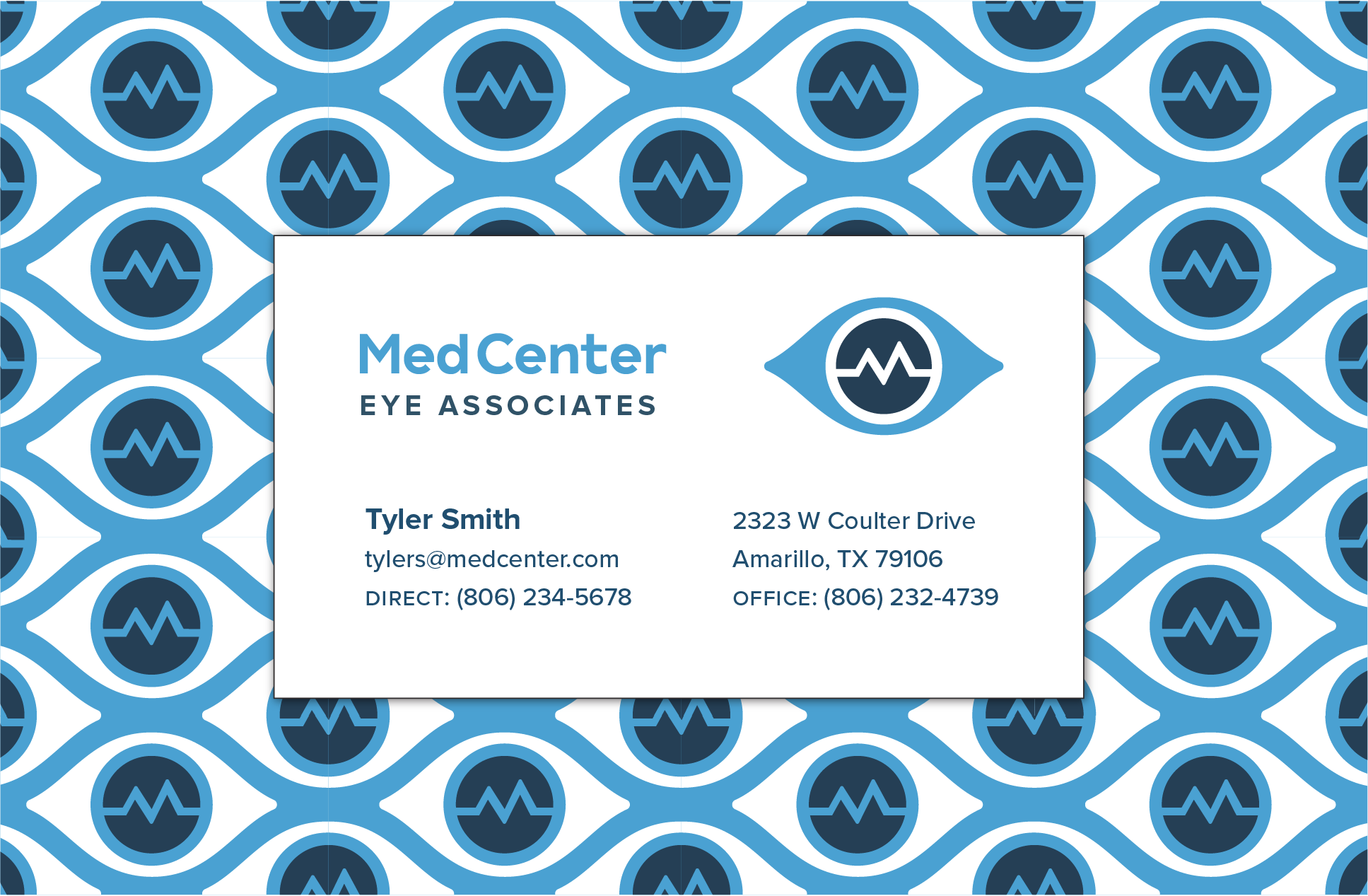
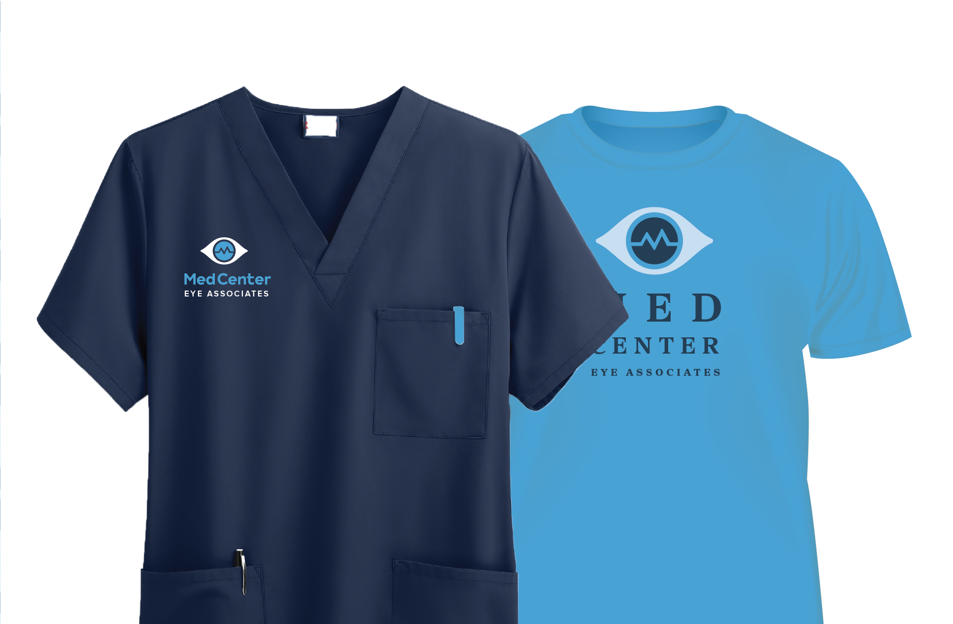
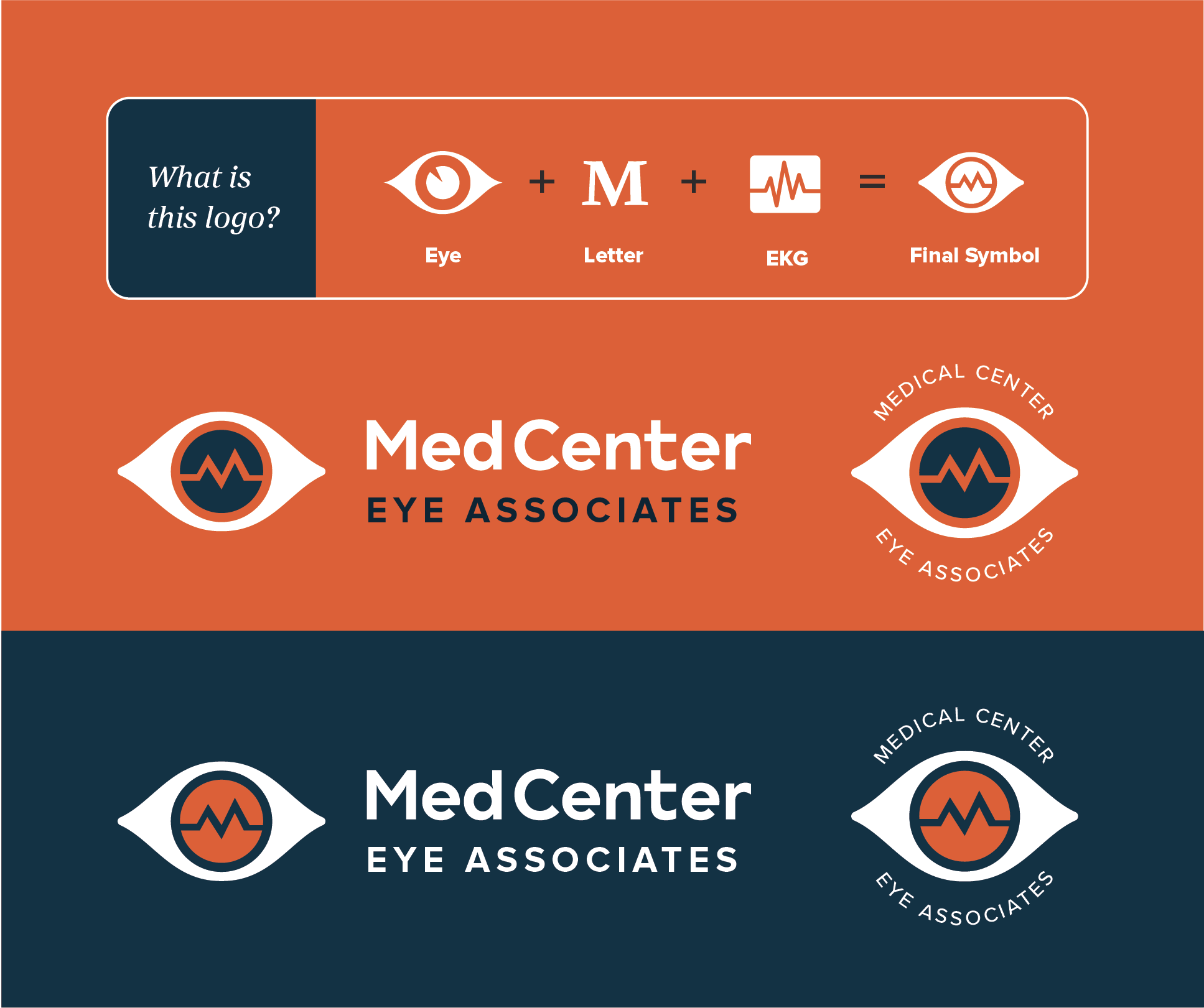
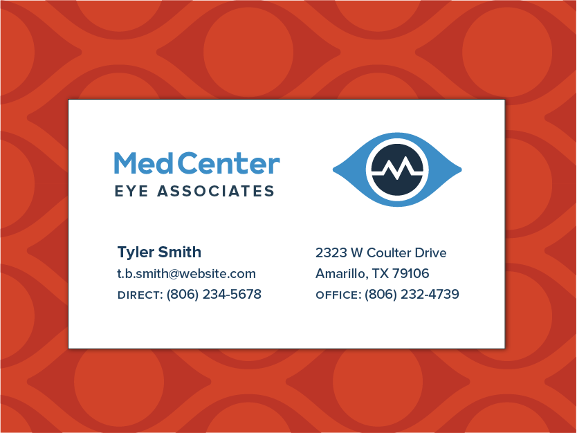
We ultimately found the solution in a mark that cleverly packs an eye, an M, and the medical concept into a compact symbol—one that makes a huge statement on the front of a building. I lastly designed a custom font based off the clunky letters of an eye chart to drive home that this was an office, not a store.
Let me know where you are in the process, whether you’re just flirting with the idea of changing, or you’re ready to hit the ground running tomorrow!